
Can You Still Own a Colour in Branding?
Can a brand really own a colour? If you asked Cadbury, Tiffany & Co., or Post-it, they’d probably say yes. Their colours are legally protected, instantly recognisable, and emotionally loaded. Cadbury purple isn’t just purple—it’s a feeling. Tiffany blue might as well be patented serenity. These brands have had decades (and deep pockets) to build associations that now feel like second nature.
But what about newer brands? Are all the good colours already taken? Can a startup or local brand still carve out colour territory in a sea of visual noise? Has the long history of all the other brands locked up new brands?
Here’s the thing...owning a colour today doesn’t mean planting a flag in a Pantone chip. It means owning context. It means showing up consistently in the right places, with the right story, until people associate that tone with your brand...not just visually, but emotionally. A red isn’t just red when it feels like urgency, energy, confidence or green isn't just green when it evokes renewal, growth, life, and vitality.
“Owning a colour today doesn’t mean planting a flag in a Pantone chip. It means owning context.”
And when we zoom in, localised branding can play by slightly different rules. Global brands need safe, scaleable consistency. Local brands, colour can be more expressive and culturally tuned...less about ownership, more about resonance.
So no, colours aren’t all taken. But the shortcut’s gone. If you want to own a colour now, you need to earn it. Through story. Through consistency. Through depth.
Because in a world where everything’s designed, distinction doesn’t just come from hue...it comes from how you show up.
Here are some standout Australian brands that own colour visually and emotionally:

Afterpay – Mint/Teal Green
Afterpay’s signature minty green sets it apart in the fintech world, where blues and blacks dominate. The colour feels fresh, modern, and reassuring…exactly what you want from a payments platform.

Aesop – Earthy Neutrals
Aesop may not “own” a colour in the traditional sense, but their consistent use of muted browns, greys, and neutrals across product, store design, and packaging is iconic. Their stores are a standout for me, branded through tone and restraint…and made it unmistakably theirs.
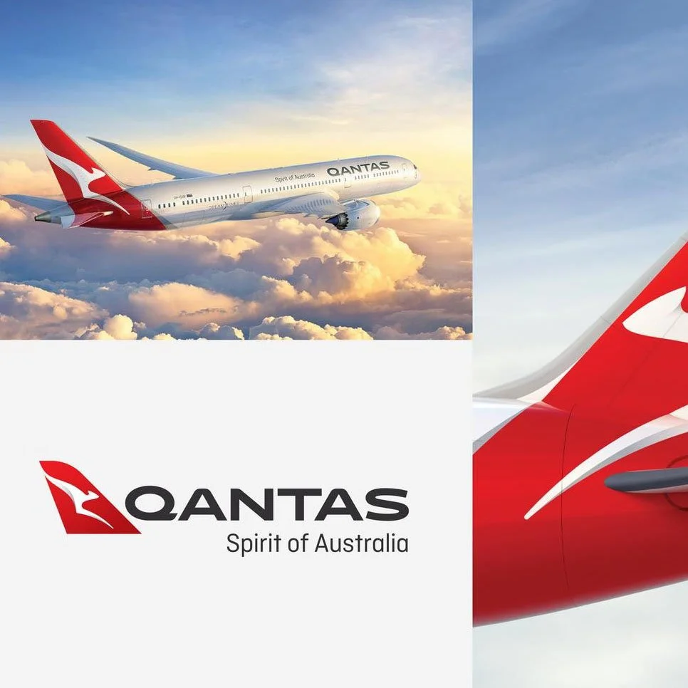
Qantas – Red
Qantas red isn’t just red…it’s legacy. The tailfin, the uniforms, the campaigns. Red runs through all of it. It’s a powerful example of a heritage brand owning a bold colour without needing to reinvent.

Frank Body - Blush pink
Frank Body owns a cheeky, millennial pink that feels instantly recognisable. Their entire identity plays into this youthful, social-native tone, making it easy to spot on shelf or scroll. Pink in this case is used as empowerment—not softness.