Field Notes.
Loose fragments. Fleeting ideas. Things noticed.
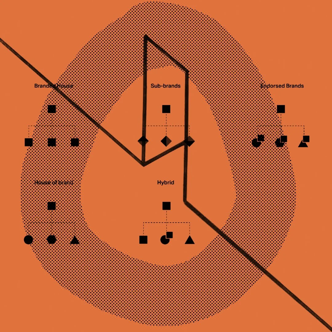
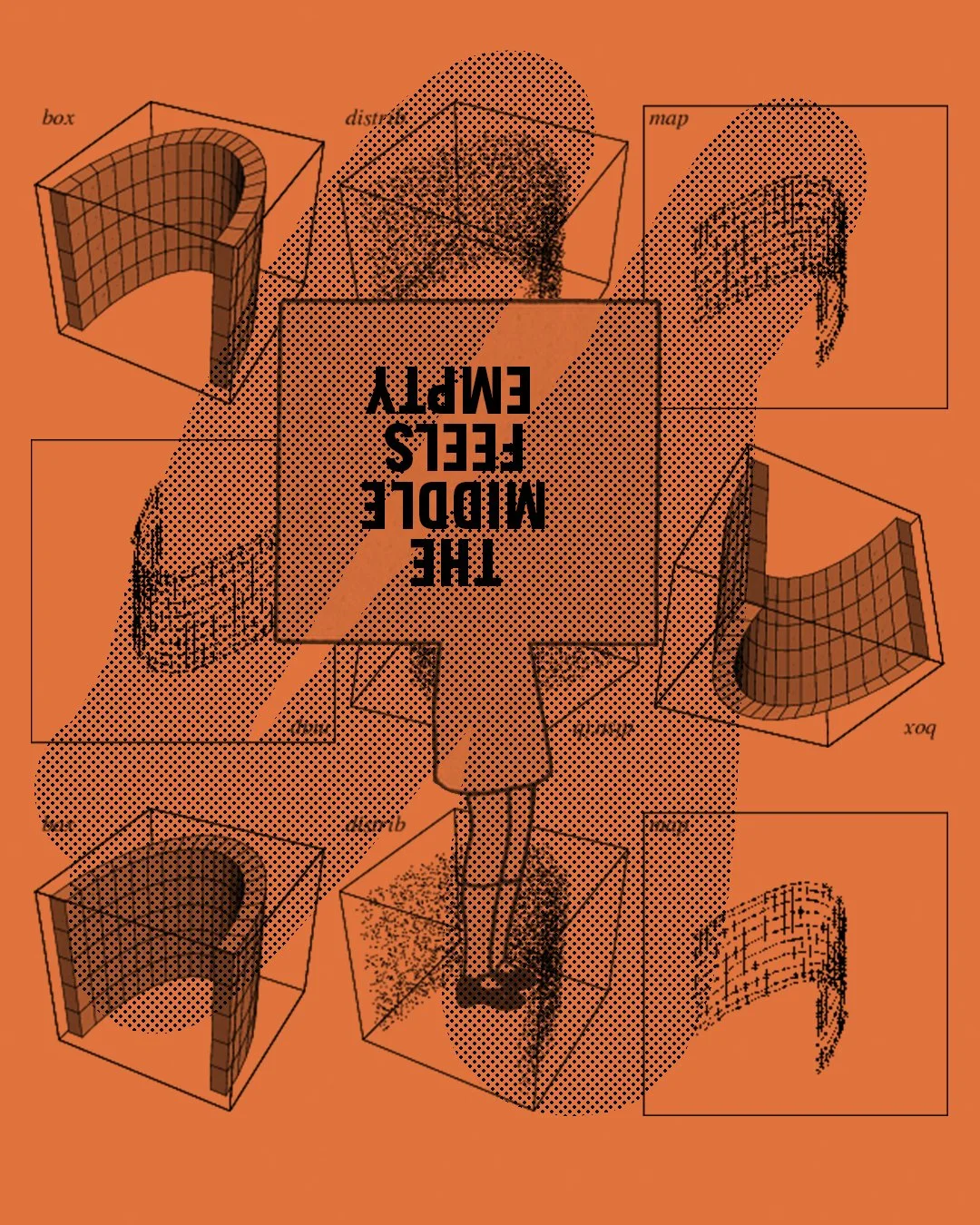
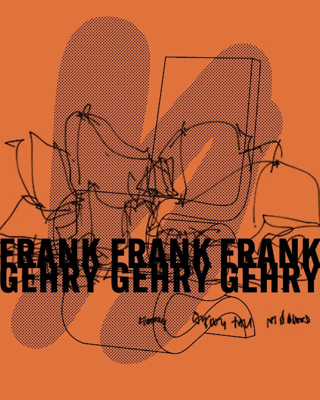
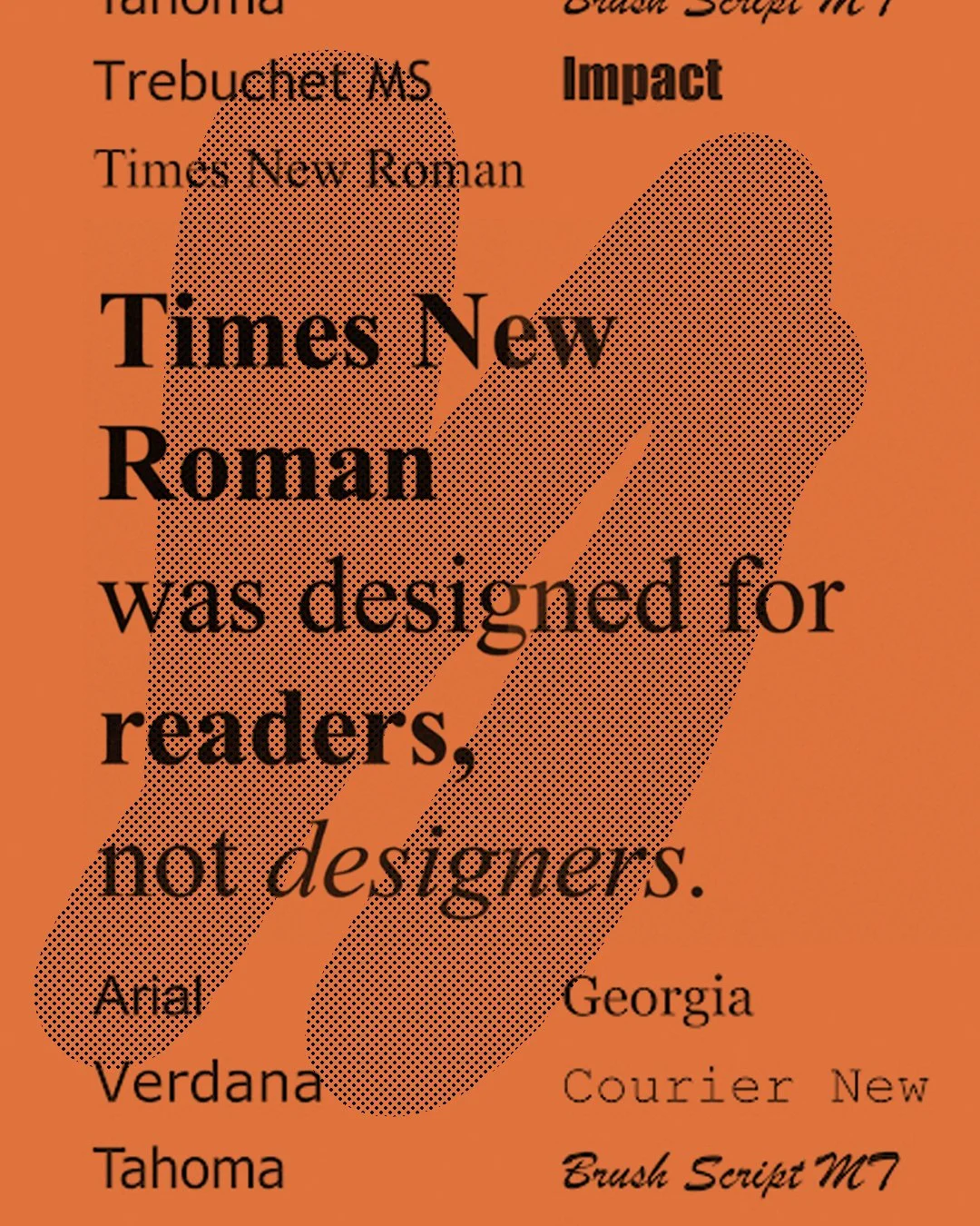
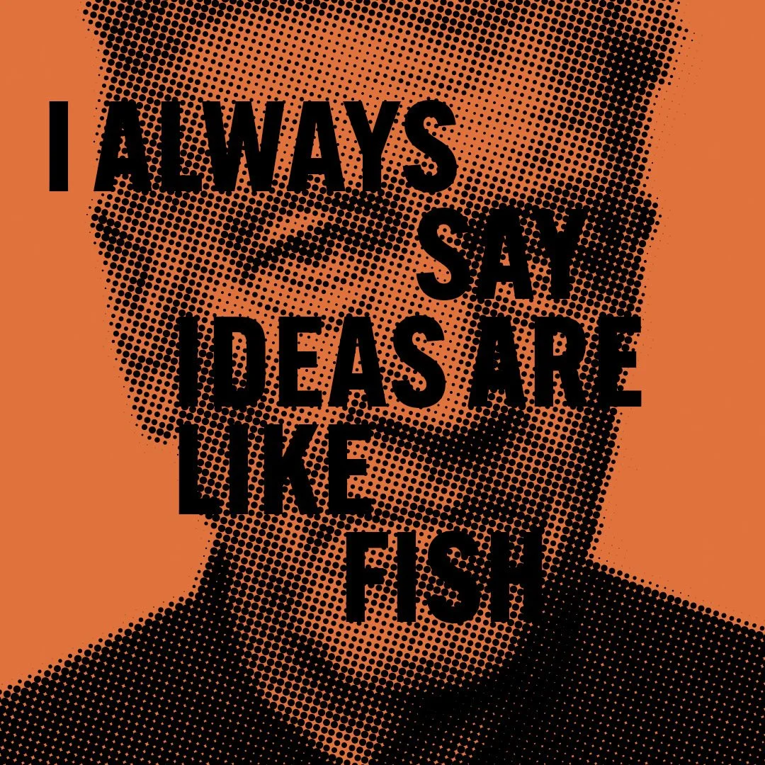
Collected pieces from the in-between. A sign. A surface. A code experiment. A prompt from a model. These are moments that often go unseen but mean something — glimpses of how brands emerge through intuition, materials, and the tools we shape them with. Sometimes analogue, sometimes digital — always observed.
We don’t need camera shutter sounds anymore. Or vinyl crackle. Or buttons that pretend to be physical. And yet… we keep them. Skeuomorphism is design’s comforting lie, a way the future reassures us by sounding like the past.
Balance used to be safe. Neutrality used to signal credibility. Today, the middle feels empty. This Field Note explores how brands are responding to a culture that rewards conviction over consensus — and why the future is being designed at the extremes.
Why Frank Gehry’s wildest ideas outlived the critics who said they’d never work.
We didn’t pick these default fonts; they were handed to us by engineers with zero interest in aesthetics.
A new wave of non-alcoholic drinks is reshaping the culture of social drinking. Brands like Something & Nothing, Mellows, Dayse, and Mateo are building a parallel drinking culture…one that’s calm-forward, functional, and designed for a reset rather than a blur.
When art stops making us shift, it can become decoration.
A David Keith Lynch quote about idea’s.