Helvetica: The Typeface That Won’t Let Me Go
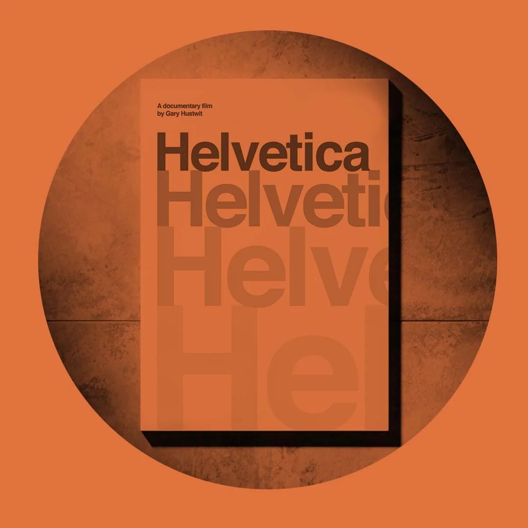
I recently revisited Helvetica, the documentary by Gary Hustwit...and if you haven’t watched it, it’s more than just a film about a font, it’s a snapshot into modern design, brand identity and how something seemingly neutral can say everything.
To set the scene from my POV, Helvetica “the font” is a 10/10. In my arsenal of tens of thousands of fonts...why do I always come back to Helvetica? I sometimes get annoyed with myself, but then I load it up, it just works. In different ways, every time.
There’s a reason it’s a cornerstone in my design world.
The flexibility.
The neutrality.
The quiet strength.
“The flexibility. The neutrality. The quiet strength.”
And then there’s the many cuts, editions, reworks "Neue", variables. It's always a blank slate that brings its own tone.
One of my interesting takeaways from the doco was how many iconic brands use Helvetica in thier brandmarks...and yet they all feel entirely their own. The context, the spacing, the layout, all these slight variations in design change how Helvetica behaves. It reflects something different...authority, style, calm, structure, modernism, silence.
Watching designers in the film debate its use...some seeing it as perfection, others as oppressive, which reminded me why I love it. It holds space for that kind of discussion. What font can be that clean and still stir that much emotion.
So yes, I’ll continue to have Helvetica at the top of my list.
Maybe a little too often.
But only because it gives me room to let the design speak.
I highly recommend the film, even if you're not a typophile.
For s%$ts and giggles, here are some famous brandmarks from technology to fashion to automotive industries using Helvetica


