

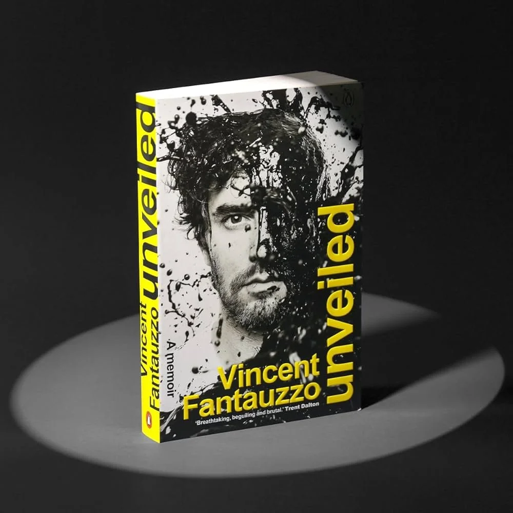
Vincent Fantauzzo at AGWA
Knowing Vincent Fantauzzo as “the Archibald-winning artist” is one thing. Hearing his raw story…and then standing in front of the work, is something else entirely.
I knew of Vincent Fantauzzo before stepping into the Art Gallery of Western Australia. Who didn’t? One of Australia’s most celebrated contemporary artists, Archibald Prize winner, and the painter behind Heath Ledger’s hauntingly beautiful portrait.
But knowing of someone and hearing them are very different things.
When Fantauzzo began speaking on stage, I wasn’t just impressed...I was a little disarmed. His story was raw, unpolished, and deeply human.
Growing up in Melbourne, his childhood was marked by challenges that could have easily silenced him. Learning difficulties, dyslexia, the weight of family struggles, the constant yearning for his father’s approval. He left school early, and only through a twist of fate (and a little bravado) found his way into RMIT. It was there, finally, that his dyslexia was diagnosed, though by then he’d already developed intricate rituals just to hide his struggles with writing. And it was partly through those detours that he found drawing.
Listening to him, you realise that these scars didn’t hold him back...they became his propulsion. They catapulted him into a career defined by empathy, resilience, and extraordinary craft.
“His story was raw, unpolished, and deeply human.”
What strikes me most is how Fantauzzo carries these experiences into his portraits. And that’s the thing I noticed most. When Vincent paints, it doesn’t feel like he’s just capturing the person in front of him. It feels like he’s painting from both sides of the canvas...his story, their story, meeting in the middle.
AGWA’s now showing a selection of his past and new works. If you can, go see them. Because knowing Vincent Fantauzzo as “the Archibald-winning artist” is one thing. Hearing his story — and then standing in front of the work — is something else entirely.


The talk was only one snapshot. Vincent’s story, like his portraits, reveals more the closer you look. Here are some places to start if you want to keep exploring.

ABC Conversatopns Podcast
From street fighting petty criminal to portrait artist - How Vincent Fantauzzo's life was saved by love and painting

The Sydney Morning Herald Doco
When making art, Vincent Fantauzzo says his neurodiversity is his strength.
A Pulse Worth Listening To
The West Australian Pulse 2025 felt sharper, more considered, more complex.
Living in Perth and working in the arts, I've long seen the Art Gallery of Western Australia as my local equivalent of the greats — MoMA, The Louvre, Saatchi Gallery, MONA. It's the place I return to often, ever since my school years.
One exhibition I particular enjoy annually is Pulse Perspectives (now known as The West Australian Pulse), featuring Year 12 Visual Arts graduates from schools across WA. In 2025, the exhibition marked its 33rd year...hats off to AGWA.
Call it tradition, but I'm pretty sure I've been to 98% of them.
This year, though, was a standout. I say that because something felt sharper, more considered, more complex.
“Something felt sharper, more considered, more complex.”
Over the years, the theme of "self-identity" has always played a big role in these exhibitions. But in 2025, that exploration seems to have evolved...broadened, deepened. The work no longer just looks inward, but outward and across. There was a collective intelligence forming... subcultures, social commentary, environmental reflection, mental health, racial and gender identity, and the pressure cooker of ATAR and future unknowns. All layered into paintings, sculpture, digital work, and installations.
The gallery puts it best:
“The selected works provide a window into young people's private, social and artistic concerns. Themes ranging from cultural intersections, neurodiversity, mental and neurological health challenges, to loss, inequality, and the pressure of performance.”
And you could feel it in the room.
A couple of standouts for me:

Ema Poon - Ideal: A brilliant execution. The stylisation and narrative clarity were next-level. An artist that already feels fully formed.
Brodie Rowand - Ruby Reverie: What a strong sense of composition and great use of scale, but what elevated it even more was the accompanying description. It gave the work a whole new resonance.
Find out more at AGWA
More Than Stretchy Pants: How Lululemon Tapped Into the Belonging Economy
Before “community-building” became a checkbox on every brand strategy deck, Lululemon was doing the real work.
Let’s be honest... there are a lot of brands selling black leggings and workout tops. So why does Lululemon still dominate this space? It’s not just the quality, the fit, or the price (which definitely isn’t low). It’s because Lululemon understood something early: people don’t just want great gear...they want to feel part of something.
Before “community-building” became a checkbox on every brand strategy deck, Lululemon was doing the real work. Hosting in-store yoga classes, building local ambassador networks, turning store staff into educators—not just salespeople. These weren’t gimmicks. They were bricks in a brand built around identity, aspiration, and belonging. What they really sold was a lifestyle. And that lifestyle made you feel like your best, most balanced self.
Today, we call this the belonging economy. It's the idea that people want to affiliate with brands that reflect their values, their goals, their tribes. Lululemon didn’t just market clothing—they marketed a mindset. They turned fitness into ritual, retail into experience, and branding into a way of life.
“Before ‘community-building’ became a checkbox on every brand strategy deck, Lululemon was doing the real work.”
The story goes it was founded in Vancouver, Canada, in 1998 by Chip Wilson. Wilson developed a proprietary skintight fabric and decided to use it to create high-performance yoga apparel for women, seeing an opportunity to fill a gap in the market. What started as a design studio by day and yoga studio by night soon became a standalone store in November of 2000, and that story in itself connects the brand at ground zero.
So, if you're building a brand in today’s market? Don’t just think about the product. Think about the people. Ask yourself: What do they want to be part of? What rituals can you support? What moments can you make feel like theirs? That’s where the real loyalty lives...and where culture starts to form.
Here are four brands operating in a similar space as Lululemon…each tapping into community, lifestyle, and identity, but with their own distinct twist:
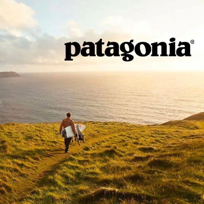
Patagonia – Purpose-Driven Tribe
Where Lululemon centers on self-betterment and movement, Patagonia speaks to environmental purpose and activism. Its customers don’t just wear the gear…they buy into a worldview. From donating profits to environmental causes to encouraging consumers not to buy new unless necessary, Patagonia thrives by making values feel wearable.

Sporty & Rich – Wellness Meets Wardrobe
Founded by Emily Oberg, Sporty & Rich blends vintage athleticwear aesthetics with a minimalist, aspirational lifestyle brand. What started as a moodboard-style Instagram has grown into a label that champions health, beauty, and intentional living—not unlike Lululemon’s core messages.

Rapha – Cycling, Cultured
Rapha has built a luxury cycling brand that mirrors Lululemon’s model: high-quality gear, beautiful branding, and most importantly…a powerful sense of belonging. I have seen this brand for years as a cafe and never really new what they stood for, so this makes sense. Their cycling clubs, cafes, and rides are as important as the products. Rapha doesn’t just sell you a jersey; it gives you a seat at the (handlebar) table.

HOKA – Comfort with Cult
This athletic shoe brand came out of nowhere and is now a quiet cult favourite. Its performance roots (ultra-running, endurance) have fused with fashion and lifestyle. HOKA isn’t flashy—it’s real, practical, and increasingly loved by wellness types, creatives, and athletes alike. Not something I would go for, (me and sport dont mix. Ha!) but I get it, their growth is proof that when the product works and the culture fits, a brand can thrive fast.
Guy Ritchie’s Style is a Brand
Guy Ritchie’s work is like a brand. Consistency. Tone. A voice. Every choice he makes builds something you recognise, even if you don’t always love it.
Guy Ritchie....A master of creating a one-of-a-kind signature cinema style.
Lock, Stock and Two Smoking Barrels hooked me and I still remember to this day watching it for the first time...camera jumping between characters, freeze frames dropping in, wide-angle POV shots you could practically feel in your chest. The pacing, the cuts, the chaos...and then the music. Every track just worked, even though on paper it probably shouldn’t.
And I thought, this is a director with a brand. You can spot it from a mile off.
Fast forward to The Gentlemen the styles still there. The parallel multiple scenes, the title sequence, the fast dialogues, the Cockney slang, the Chutzpah, the grit, the transitions, the sharp-as-hell wardrobe, the energy that feels like it’s been edited to a beat you didn’t even realise was playing. It’s all designed...deliberate, layered, full of flavour.
“It’s impossible to describe any artist’s style.”
What I love is that no one’s really pulled off a proper copy. You see movies trying the same angles, same sound choices...but they just don’t land it. Because Ritchie’s films aren’t just about how they look. They’re about how they feel. The tension. The timing. The attitude. That stuff’s hard to replicate. It’s not just editing...it’s instinct.
And that’s why I think of his work is like a brand. There’s consistency. Tone. A voice. Every choice he makes builds something you recognise, even if you don’t always love it. It’s like watching someone who’s fully dialled into their creative fingerprint...and that’s rare.
So yeah. The Gentlemen hits it.
The Extreme Self (and the Truth That Hits a Bit Too Hard)
The Extreme Self is one of those books you pick up and instantly wonder...is this a book...or a beautifully designed nervous breakdown?
The Extreme Self is one of those books you pick up and instantly wonder...is this a book...or a beautifully designed nervous breakdown?
Co-authored by Douglas Coupland, Hans Ulrich Obrist, and Shumon Basar, it reads like a mirror held up to modern life, but instead of reflecting your face, it reflects your anxieties, contradictions and online behaviours...layered and glitching in real time.
Across 13 chapters it unpacks how individuality is being redefined by tech, politics, aesthetics, and emotion. The pages aren’t linear. They’re observational, chaotic and strangely poetic. It’s full of statements that feel like Instagram captions, TED Talk summaries, and subconscious thoughts all rolled into one. And so randomly every one feels oddly accurate.
What makes the book special is that it doesn’t preach, it observes. It stitches together the way we perform, adapt and scroll through modern existence. But it’s all very now. It feels like design theory collided with meme culture, filtered through a deeply existential lens.
It’s not a book I’d recommend reading cover to cover in one sitting. It’s a book to dip in, flip through, stare at. See how much of it matches your own patterns and then don’t now what to do with it.
The final line?
“Restore me to factory settings.” A button I’d like to press some days.
140 Ideas and One Garden
140 Artists' Ideas for Planet Earth. A book that is beautifully erratic, experimental and often wild compilation of thoughts.
I recently picked up a book called 140 Artists' Ideas for Planet Earth...and it's exactly what the title suggests. A beautifully erratic, experimental, often wild compilation of thoughts from artists, activists, visionaries, and makers who live outside the usual boundaries.
The back cover sums it up perfectly..."Through 140 drawings, thought experiments, recipes, activist instructions, gardening ideas, insurgences and personal revolutions..." This isn’t a manifesto. It’s a mosaic. And in a world obsessed with hot takes and headlines, it was refreshing to engage with something so open ended and unpredictable.
Some ideas were chaotic. Some calm. Some made me smile. Some made no sense at all. But I think that’s the point. This book isn’t about answers...it’s about entry points. A sideways thought that grows over time.
One piece that really stayed with me was by Precious Okoyomon called Untitled (2019);
Write down your fears on a white square piece of rice paper
Fold the paper into a tiny triangle
Set it on fire
Take the ash outside
Put it in dirt
Plant a flower in the dirt (pansies, cosmos, snapdragons)
Repeat until you have a garden
It’s part ritual, part art, part activism. And to me it captures the spirit of the whole book...transformation through intention. A small act that becomes a gesture. A gesture that becomes a symbol. A symbol that eventually becomes change.
I know I’ll keep dipping back into this book...not just for ideas but for an alternative mindset.
Helvetica: The Typeface That Won’t Let Me Go
Helvetica, the documentary by Gary Hustwit exposed was how many iconic brands use Helvetica in thier brandmarks.
I recently revisited Helvetica, the documentary by Gary Hustwit...and if you haven’t watched it, it’s more than just a film about a font, it’s a snapshot into modern design, brand identity and how something seemingly neutral can say everything.
To set the scene from my POV, Helvetica “the font” is a 10/10. In my arsenal of tens of thousands of fonts...why do I always come back to Helvetica? I sometimes get annoyed with myself, but then I load it up, it just works. In different ways, every time.
There’s a reason it’s a cornerstone in my design world.
The flexibility.
The neutrality.
The quiet strength.
“The flexibility. The neutrality. The quiet strength.”
And then there’s the many cuts, editions, reworks "Neue", variables. It's always a blank slate that brings its own tone.
One of my interesting takeaways from the doco was how many iconic brands use Helvetica in thier brandmarks...and yet they all feel entirely their own. The context, the spacing, the layout, all these slight variations in design change how Helvetica behaves. It reflects something different...authority, style, calm, structure, modernism, silence.
Watching designers in the film debate its use...some seeing it as perfection, others as oppressive, which reminded me why I love it. It holds space for that kind of discussion. What font can be that clean and still stir that much emotion.
So yes, I’ll continue to have Helvetica at the top of my list.
Maybe a little too often.
But only because it gives me room to let the design speak.
I highly recommend the film, even if you're not a typophile.
For s%$ts and giggles, here are some famous brandmarks from technology to fashion to automotive industries using Helvetica