Why Has Braun Become So Collectable?
Braun never set out to be collectable. The products were designed for desks and kitchens and beside beds...small radios, calculators, clocks, shavers. Objects handled constantly, noticed rarely. And yet here we are, decades later, watching them resurface on shelves and in auction rooms and in bedrooms like mine, where a small square clock sits doing exactly what it was made to do...nothing more, nothing less. The question worth asking isn't why people collect them. It's what it says about us that we need to.
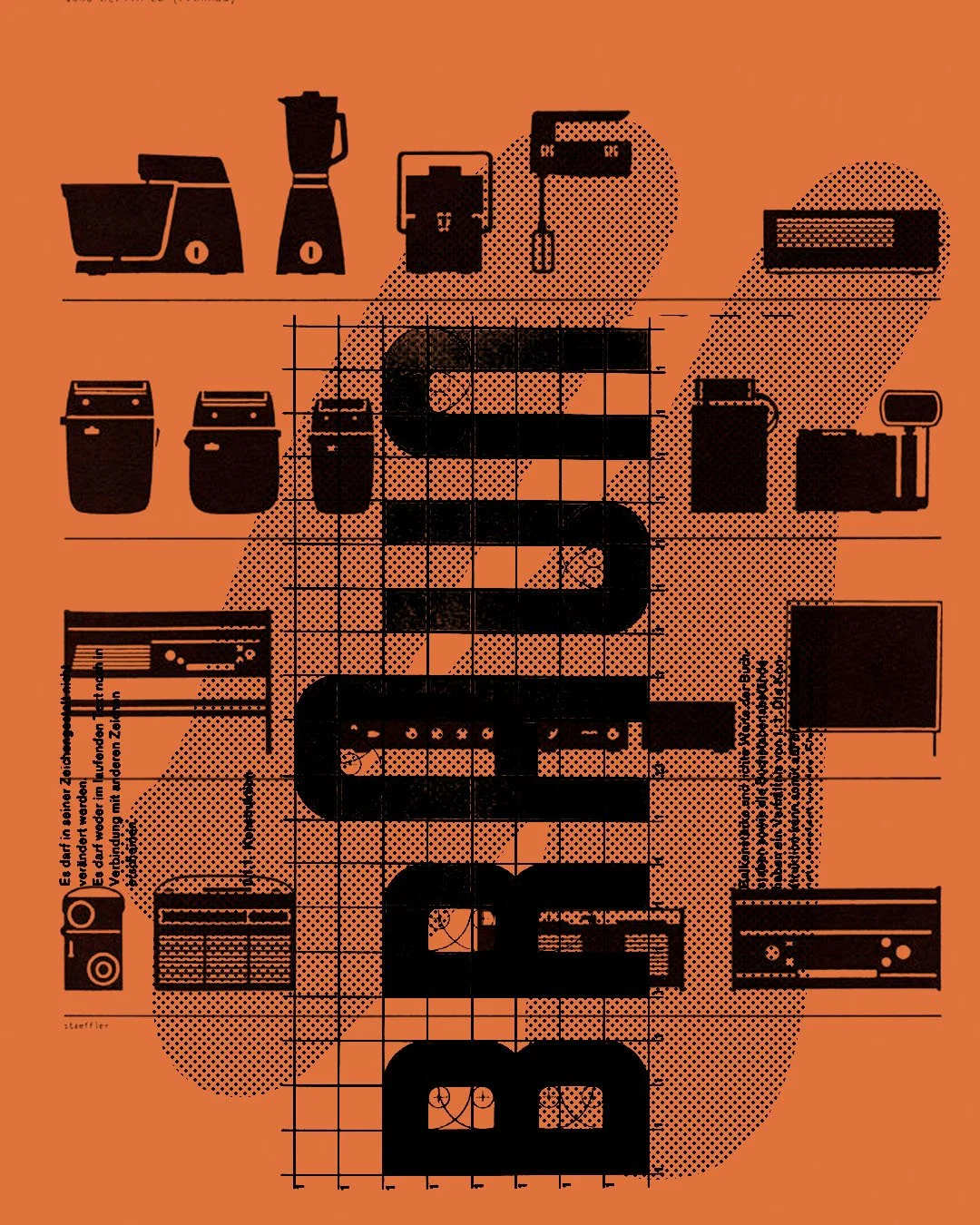
The company began in Germany in 1921, making radios and electrical components. After the war, it rebuilt with a different mindset...not decorative, not expressive, not fashionable. The focus shifted toward clarity, usability and what you might call engineering honesty. By the mid-1950s, Braun was working with designers who believed everyday objects should be reduced to their most essential form. That decision, quiet at the time, turned out to shape one of the most influential design languages ever created.
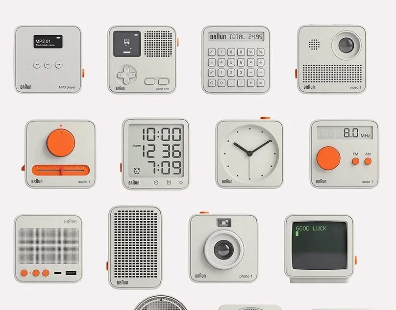
The turning point arrived with Dieter Rams and the influence of the Ulm School. Products like the SK4 record player, the T3 pocket radio and later the ET66 calculator introduced a visual discipline that was almost architectural in its consistency. Flat surfaces. Restrained colour. Typography chosen for legibility, not personality. A logic where nothing existed without purpose. The result was a family of objects that looked unmistakably related without ever feeling styled...which is a harder thing to achieve than it sounds, and rarer than it should be.
That consistency is a large part of why Braun endures. Because the products were never designed to follow trends, they don't anchor themselves to a particular era. They sit outside time in a way that most designed objects don't. A clock from the seventies feels at home in a contemporary bedroom. A radio from the sixties feels aligned with modern technology rather than opposed to it. The design language is neutral enough to move across decades without friction...and that neutrality, it turns out, is one of the most durable qualities a designed object can have.
“The products were never designed as icons. They were designed to last. Over time, that discipline became the very thing people collect.”
There is also something in the scale of what Braun made. These were not statement pieces. They were not designed for galleries or gift guides or the kind of cultural moment that inflates a thing beyond its usefulness. They were designed for daily life...for the hands, the desk, the kitchen counter. Objects used constantly over years tend to accumulate a different kind of meaning than objects that are simply admired. Familiarity builds attachment in a way that spectacle never quite manages. When those objects resurface later, they don't feel nostalgic so much as continuous...as though they never really left, they just waited.
Rams' ten principles of good design...useful, understandable, honest, long-lasting...are often cited as the philosophical backbone of it all, and they are. But what made those principles matter wasn't that they were written down. It was that they shaped actual decisions: about proportion, about material, about the restraint required to leave something out when the instinct is to add. The typography was chosen for clarity. The geometry came from function. The colour palette stayed deliberately quiet so the object would sit in a space rather than dominate it.
That restraint reads differently now than it did then. In an environment where most contemporary products compete aggressively for attention...through colour, notification, novelty, noise...a Braun object does the opposite. It sits quietly. It does its job. It ages slowly and without drama. And that calmness, which might once have read as limitation, now reads as a kind of confidence. The object knows what it is. It doesn't need to tell you.
I have a small square Braun clock beside my bed. It doesn't try to impress. The type is clear, the proportions feel considered, and the form is reduced to exactly what it needs to be. It simply sits there. And somehow, in the middle of everything that surrounds it...everything that updates, refreshes, demands to be noticed...that simplicity feels more deliberate than almost anything else in the room. In a culture that has made impermanence its default setting, that turns out to be worth quite a lot.