
Is Canva the Temu of Design?
The comparison arrived fully formed, the way the uncomfortable ones usually do. Canva and Temu don't share an industry, a business model, or even a target audience...and yet something about the cultural space they occupy feels eerily similar. Both promise access. Both flatten friction. Both have, in their own way, made a category of thing so easy to acquire that it has quietly changed how we value it.
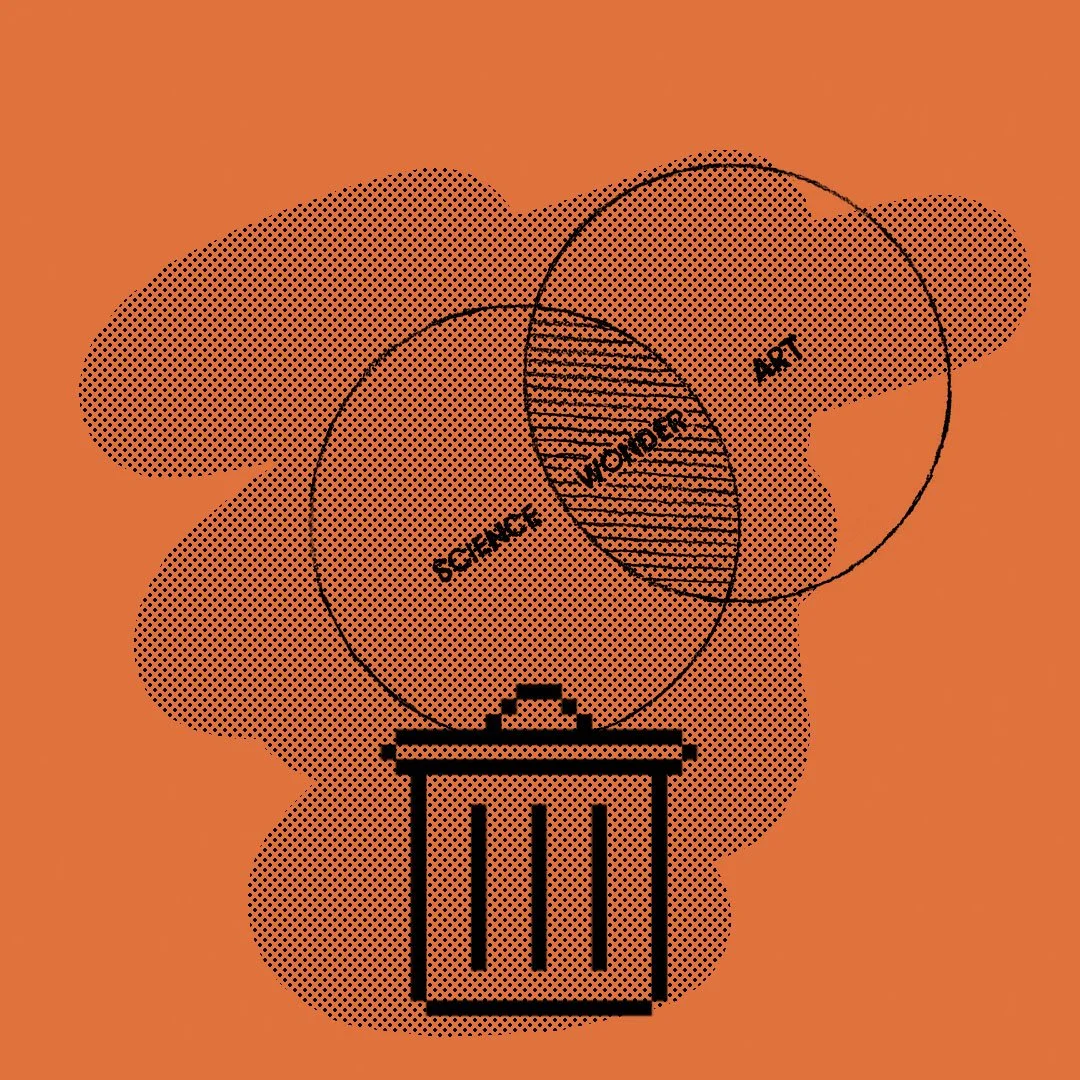
I want to be careful here, because this isn't a hit piece on either. Canva is genuinely impressive. It has opened visual expression to people and businesses who would otherwise have been locked out entirely...small founders who can't retain a studio, community organisations running on goodwill, individuals with something real to say but no technical pathway to say it. The democratisation is real, and it matters. But democratisation is rarely a simple story, and the thing that makes a tool powerful is often the same thing that makes it worth examining.
Temu operates on a similar logic. Extreme affordability, extreme volume, templates that approximate the aesthetic of more considered things. The product works. The price is right. And somewhere in that efficiency, something gets quietly traded away...not quality exactly, but the intangible that sits underneath quality: the sense that something was made for you, or made to last, or made with a point of view that has any stake in its own existence. What you gain in access, you sometimes lose in feeling.
“Fast design solves the problem of an unbranded document. But it was never really trying to build a brand.”
Design, when it moves through Canva at scale, starts to exhibit the same behaviour. Not because the tool is incapable...it isn't...but because the template, by its nature, inverts the process. Normally, the brief generates the form. The strategy generates the shape. The constraint, the context, the thing a brand is actually trying to say...those are the inputs, and the visual outcome is the residue of all that thinking. A template reverses that sequence. The form comes first, and meaning is slotted into it like a variable. It gets the job done. But the job it does is a different job.
The consequence of that shift is subtle at first. A logo here, a social graphic there, a pitch deck assembled in an afternoon from assets that also appear in thousands of other decks. None of it is wrong. Some of it is quite good. But over time, across an entire market of brands making the same moves, the cumulative effect starts to register...not as bad design, but as indistinguishable design. A visual environment where everything is competent and nothing is memorable. Where polish has become so available that presence has become the scarce thing.
This is where the tension sits for studios, for creatives, and for brands that want to do deeper work. Not in whether these tools are good or bad...that framing is too simple...but in what it means when clients absorb a tool-driven model of design as their reference point for what design is. When the template becomes the expectation, the harder conversation about why something should look a particular way, what a brand is actually communicating, what the experience of encountering it should feel like...that conversation can feel like an extravagance. A slow luxury for people with time and budget to spare, rather than the essential work it actually is.
“Design has never just been about how something looks. It’s the layers beneath the layout.”
Fast fashion solved the problem of expensive clothes. Fast furniture solved the problem of empty rooms. Fast design solves the problem of an unbranded document. But none of them build anything that lasts, because they were never really trying to. The thing they optimise for is acquisition, not attachment...and that distinction matters more for brands than almost anywhere else, because a brand is nothing if not a system for creating attachment over time.
So no...Canva isn't the villain. And the comparison to Temu isn't meant to be a verdict. It's a provocation, in the way the best comparisons are: two unlike things that, when placed next to each other, illuminate something about the culture that produced them both. What they reveal, I think, is a broader appetite for access over authorship...for having the thing rather than understanding what the thing is for.
Design has never just been about how something looks. It's the layers beneath the layout: the strategy that determines what a brand emphasises, the restraint that makes certain choices land harder than others, the rhythm and context that give something presence rather than just polish. Those aren't features you can pull from a template library. They're the outcome of a process that starts somewhere else entirely...with a question, not a canvas.
Whether Canva is making design feel cheap, or whether we're simply choosing to use it that way, is almost beside the point. The more interesting question is what we lose when we stop asking the difference.