
Who Chose These Fonts for Us?
Times New Roman, Arial, Courier, Verdana, Calibri....Why have we all been held hostage by the same handful of typefaces for decades.
Every designer knows the feeling: you open a PowerPoint deck or a corporate document, and instantly you’re transported back to the same default fonts that have followed us through entire careers.
Somewhere between OG Windows 95 and early web browsers, that this was the typographic palette we’d all be stuck with forever. And somehow, we still are.
The funny part is that none of these fonts were chosen for beauty, personality or brand expression. They were chosen for survival. Early operating systems needed typefaces that were simple to render, universally available and impossible to break. Engineers...not designers, made the calls, favouring stability over aesthetics. And in an era of unpredictable printers, slow processors and terrifyingly fragile software, practicality won.
Then came the early web. Browsers could only display fonts already installed on your computer, so designers built websites using whatever Windows and Mac shipped with. That’s how “web-safe fonts” became a thing — a list that reads like the stationery cupboard at a government office. The limitations weren’t creative; they were infrastructural. And those limitations set the tone for decades.
Corporate IT departments cemented it even further. Arial and Times delivered the lowest risk: no licensing issues, no rendering errors, no support tickets. Large organisations locked them into templates, PowerPoint masters, entire ecosystems. Changing them wasn’t just a design decision; it was a logistical nightmare. So nobody changed anything.
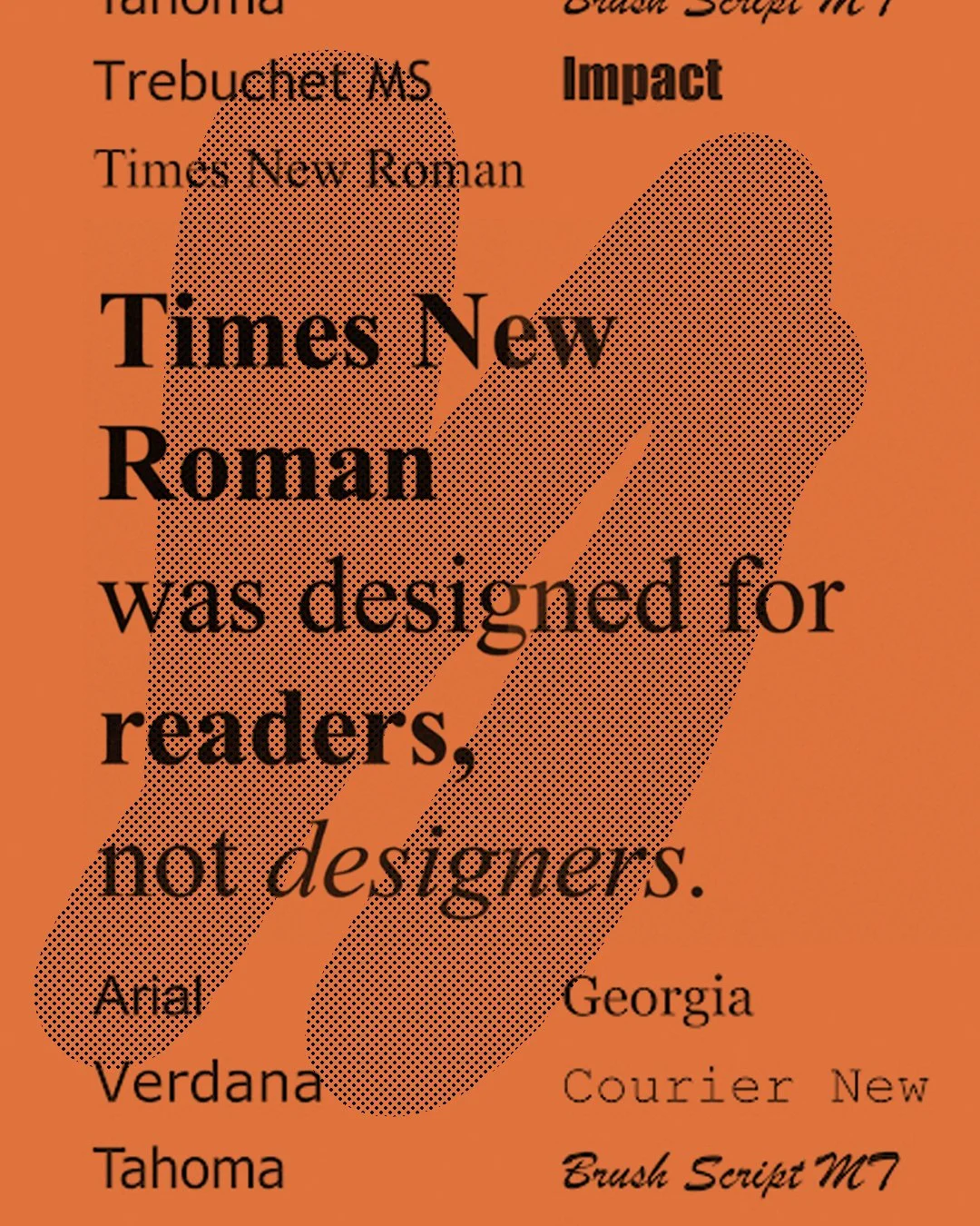
“Each of these typefaces was crafted to solve a technical challenge, long before they became everyday defaults.”
But what interests me most is the psychology of the default. Defaults feel neutral, which makes them feel “safe.” People assume Arial is professional. Times is respectable. Courier is official. None of that is objectively true...we’ve just been conditioned by repetition. A long enough pattern becomes a cultural norm, and a cultural norm becomes a creative limitation that nobody questions.
Thankfully, the landscape has shifted. Webfonts, variable type, cloud libraries and auto-sync brand kits offer what designers always wanted: control. Brands no longer need to inherit whatever came pre-installed on a 1997 operating system. Typography can finally be expressive, intentional and unique again...the way it should be. Well sort of.
Who designed...
Times New Roman — Stanley Morison & Victor Lardent (1931)
Times New Roman was created in 1931 when newspaper typographic advisor Stanley Morison challenged The Times of London to modernise its outdated print face. Morison provided the direction and typographic philosophy; Victor Lardent, a draftsman in the paper’s advertising department, sketched the letterforms. Designed for newspaper constraints…narrow columns, tight printing conditions, and the need for absolute legibility. Times New Roman became a benchmark for efficiency and clarity. What began as a practical commission for a single publication eventually became one of the most widely used typefaces in the world, largely because its design was timeless, functional, and easy to reproduce across early printing technologies.
Arial — Robin Nicholas & Patricia Saunders (1982, Monotype)
Arial was designed in 1982 by Monotype’s Robin Nicholas and Patricia Saunders, not as a groundbreaking typographic innovation, but as a pragmatic solution. Microsoft needed a metrically compatible alternative to Helvetica…something that could fit into the exact same character widths without licensing the original. Arial was built to drop into systems seamlessly, offering clean, simple forms that printed well on the emerging home and office printers of the time. While designers often critique it for being too neutral or derivative, its neutrality is precisely why it became ubiquitous.
Verdana — Matthew Carter (1996, for Microsoft)
Verdana was created in 1996 by legendary type designer Matthew Carter specifically for the digital era. A time when screens were low-resolution, pixel grids were coarse, and on-screen reading was genuinely difficult. Carter expanded x-heights, opened counters, and exaggerated spacing so the letterforms would hold their shape even at tiny sizes on clunky monitors. This wasn’t a traditional print font adapted for screens; it was one of the first truly screen-native typefaces. Verdana’s design solved a technical challenge so effectively that it became a default for web readability, influencing how early websites looked and how digital typography evolved.