
The Syrup Doesn't Lie. The Packaging Does.
It was a Sunday morning, and all I wanted was pancakes. Simple enough. I found myself standing in the supermarket aisle, scanning the shelf for maple syrup...and what I found was something more instructive than I'd bargained for.
The bottles were beautiful, in their way. Amber glass, kraft labels, serif typefaces that whispered of Vermont farmhouses and cold mornings and sap running slow through birch-tapped trees. The visual language was consistent, confident, and completely fluent in the grammar of authenticity. And then I turned them over and read the ingredients.
Glucose syrup. Fructose. Colour (150d). Maple flavour. No maple syrup. Not one drop of it.
The product wasn't fraudulent, technically. The word "maple" appeared in the name, but always companioned..."maple-flavoured syrup," "maple-style topping"...in just the way that keeps the lawyers quiet. What had done the deceiving wasn't the text at all. It was everything else: the warm palette, the hand-drawn illustrations, the suggestion of something foraged and made with care. The design had told a story the ingredients had no part in. And in that gap between what the packaging communicates and what the product contains, something important about our industry sits, quietly waiting to be examined.
There's a version of brand work that serves the product...that finds the most honest, resonant way to help someone understand what a thing is and why it matters. And there's a version that covers for the product, deploying the aesthetics of authenticity in the service of something that doesn't deserve them. Both use the same tools. The same colour theory, the same typographic intelligence, the same understanding of how humans read visual cues and build trust through them. The difference isn't craft. It's intention.
“The design had told a story the ingredients had no part in.”
This is what makes the maple syrup shelf such a precise little case study. The fake syrups haven't accidentally stumbled into the visual language of craft and provenance...they've studied it, and deployed it deliberately. They know that amber glass reads as premium. That a restrained label with a hand-drawn element reads as small-batch. That earthy tones and natural textures read as honest. These are not naive choices. They are a fluent misuse of the signals that genuine makers have built up over decades of actually doing the thing.
What we're looking at, on that supermarket shelf, is trust laundering through design.
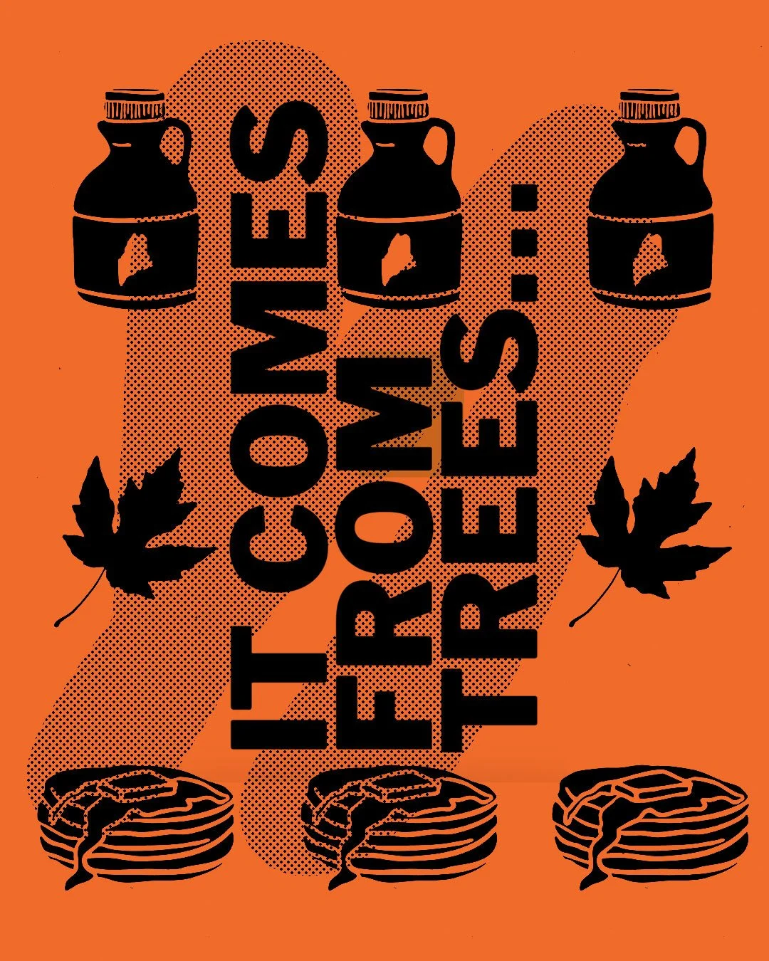
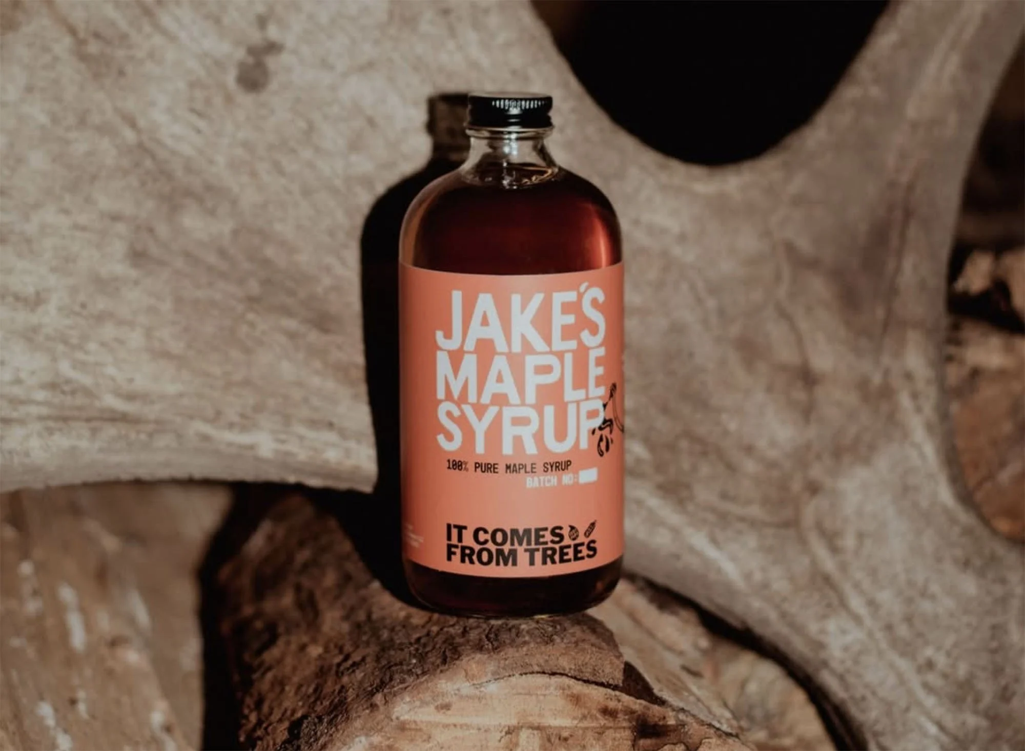
Which brings me to a small maple syrup producer out of Vermont called Jake's Maple Syrup. Jake and his partner Sorrel tap 13,000 maple trees each spring, collect the sap, and boil it down in a wood-fired evaporator until it becomes syrup. The brand is clean, direct, and does exactly what good brand work should do: it makes a true thing legible.
But the detail that stopped me was a line on their site, positioned with the casual confidence of a statement that shouldn't need to be made: It comes from trees.
That sentence is funny, until you realise it isn't. It only exists because the category has been so thoroughly infiltrated by corn syrup and artificial flavouring that origin...the most basic fact about a product...has become a differentiating feature. Jake's isn't being charming. They're being precise. In a market where the design does the lying so the copy doesn't have to, stating the obvious has become an act of integrity.
The question worth sitting with isn't whether tighter labelling laws would fix this...they might, and in some markets there's genuine regulatory pressure moving in that direction. The more interesting question, for those of us who work in brand and design, is what our role is in the problem.
“The best brand work we do narrows the gap between signal and substance... it makes the real thing more legible, not the fake thing more plausible.”
Because the truth is that a lot of what makes those fake syrups believable isn't bad design. It's good design in bad faith. Someone with real skill made those labels. Someone understood colour psychology and shelf presence and the semiotics of the artisan economy. And they put that understanding to work obscuring rather than revealing.
This is the version of our industry that should unsettle us. Not the clumsy fakes that no one believes...the sophisticated ones that deploy everything we know about how trust is built, and use it to build something hollow.
The corrective isn't just transparency legislation, though that matters. It's a clearer-eyed practice, one that asks not just how do we make this feel true but is it. The best brand work we do narrows the gap between signal and substance. It finds the genuine thing in a product or a business and brings it forward, without embellishment, without misdirection. It makes the real thing more legible, not the fake thing more plausible.
Sometimes that means a wood-fired evaporator and 13,000 trees and a line that says, with complete sincerity: it comes from trees…Which is, in the end, everything.